Lactography
Concept and creation UX/UI Design Solution Implementation Lactography e-commerce a cheese specialty store for Mexico City, providing local products to B2B and B2C clients.
Year
2021
Client
Lactography
The Design Process
Moodboard
Cheese specialist, cheesemongers; multiple international award winners.
Client
Lactography
Year
November, 2020


UX/UI Design Strategy: Lactography
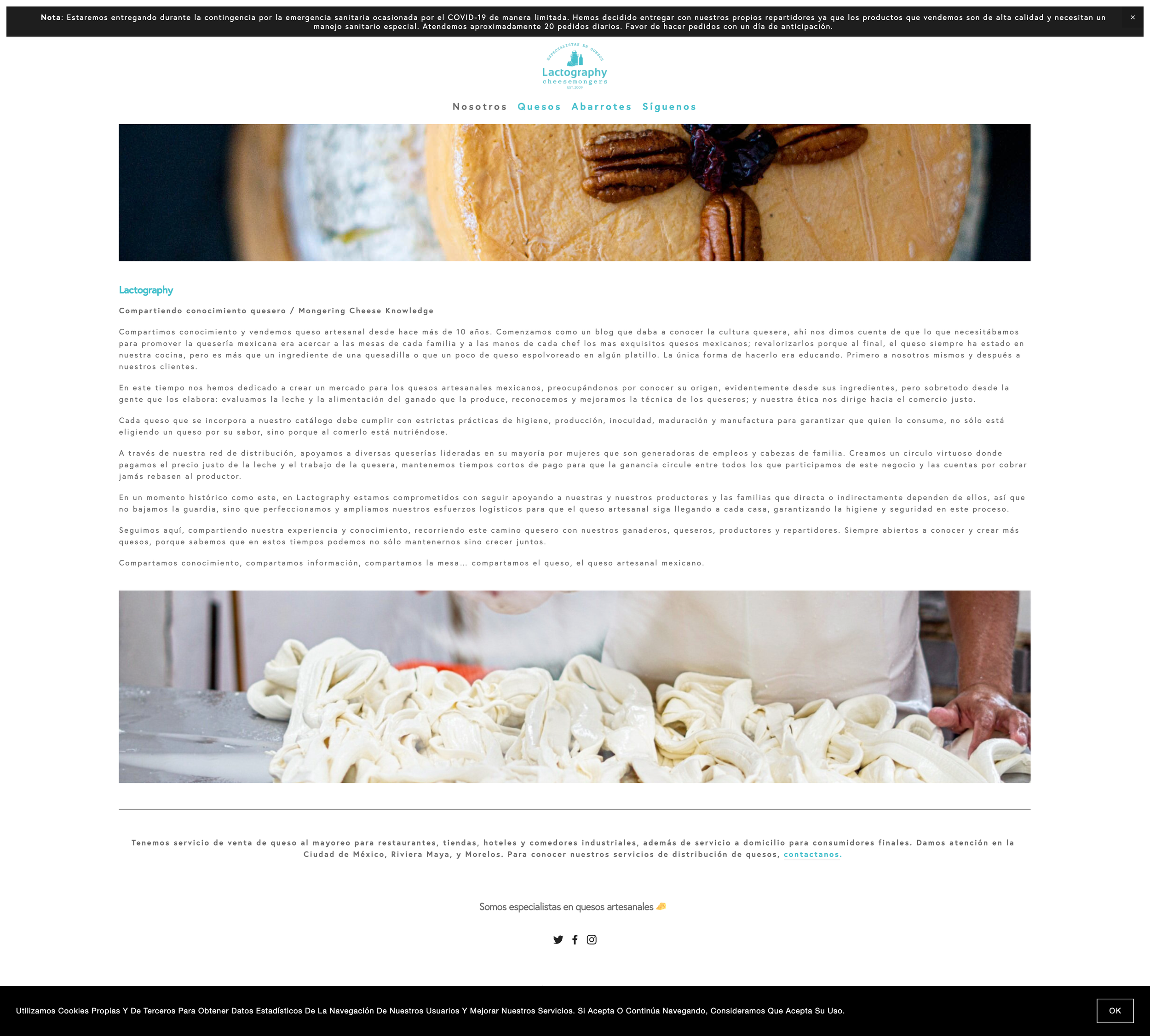
The UX/UI design strategy for Lactography’s website focused on creating an engaging and informative user experience while maintaining the artisanal essence of the brand. By combining intuitive navigation with detailed product information and catalog functionality, the design aimed to enhance both user satisfaction and conversion rates.
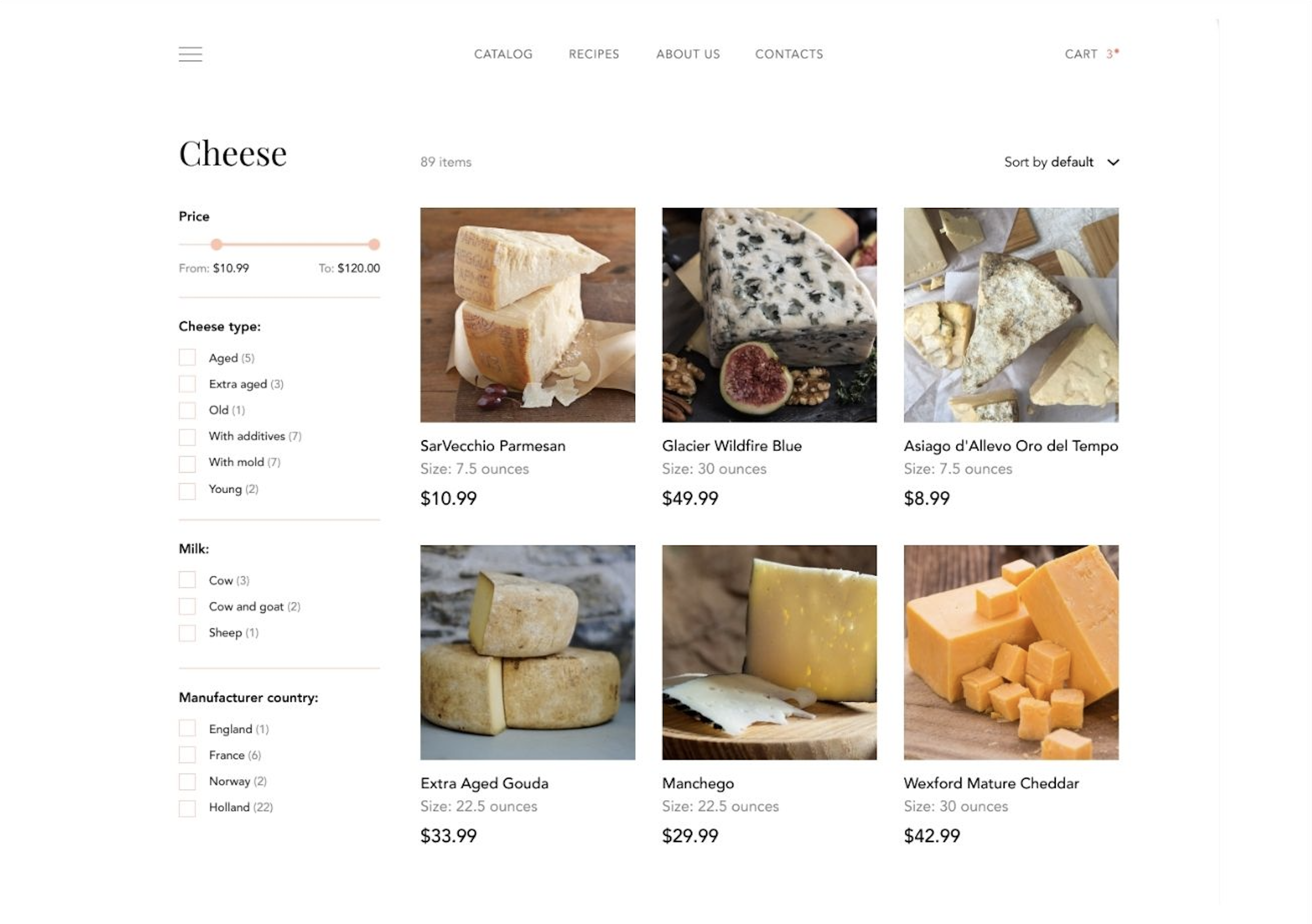
Catalog Design & Structure:
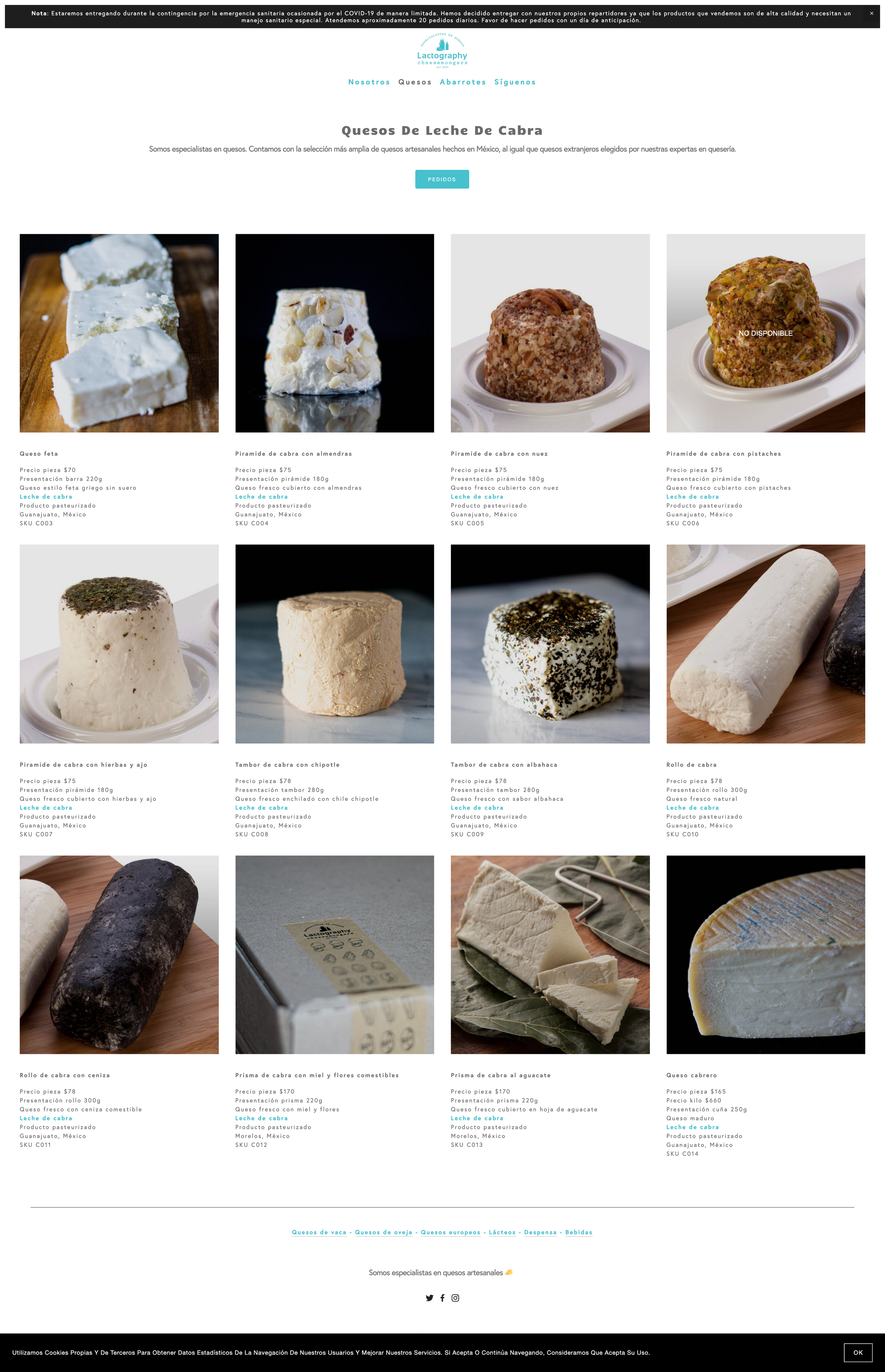
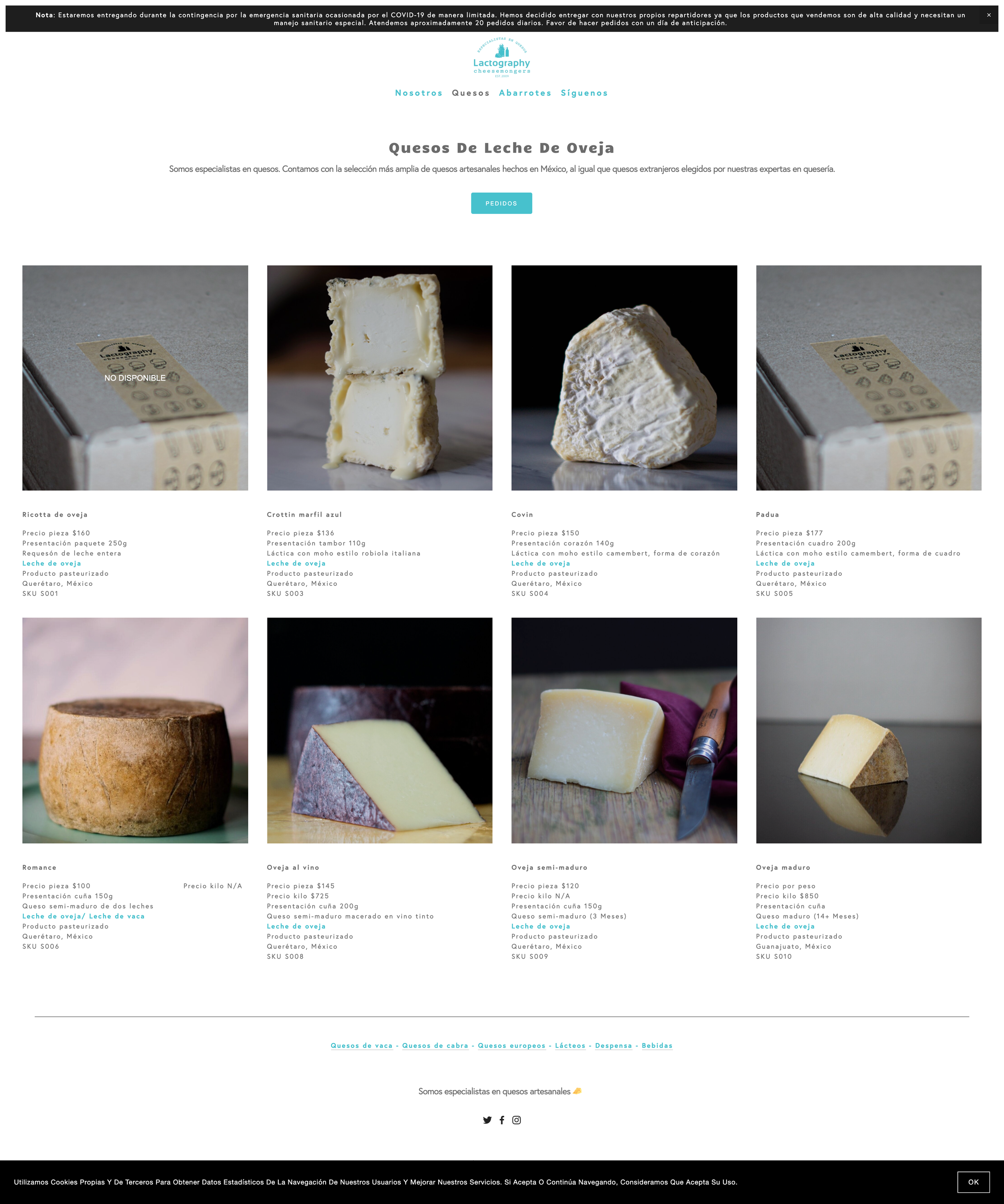
The product catalog was designed to be visually driven, presenting high-quality images of artisanal cheeses accompanied by essential product information such as name, a brief description, and price per gram or kilogram. The catalog’s layout enables easy browsing and comparison, with key filters allowing users to refine their search based on:
Cheese type
Milk type
Origin (national or international)
Price range
Non-downloadable images to protect the visual content
The visual guide accompanying the design ensures consistency in image presentation and product descriptions, reinforcing the brand.
Visual Consistency & Brand Alignment:
The interface design aligns with the Lactography brand identity, using earthy tones and high-quality images to convey the artisanal and premium nature of the products. Text elements were styled to be functional yet elegant, with specific CSS programming that highlights key details, such as the blue-colored milk type information.
User-Centric Solution:
Having deep knowledge of Lactography’s clientele, I recognized the need for a catalog that not only displayed the cheeses but also educated the consumer. The design offers a seamless experience for both browsing and buying, with an emphasis on clarity and accessibility. Drawing from extensive experience in web design, e-commerce, and programming, the entire user journey was optimized to ensure a fluid interaction—from initial exploration to purchase.
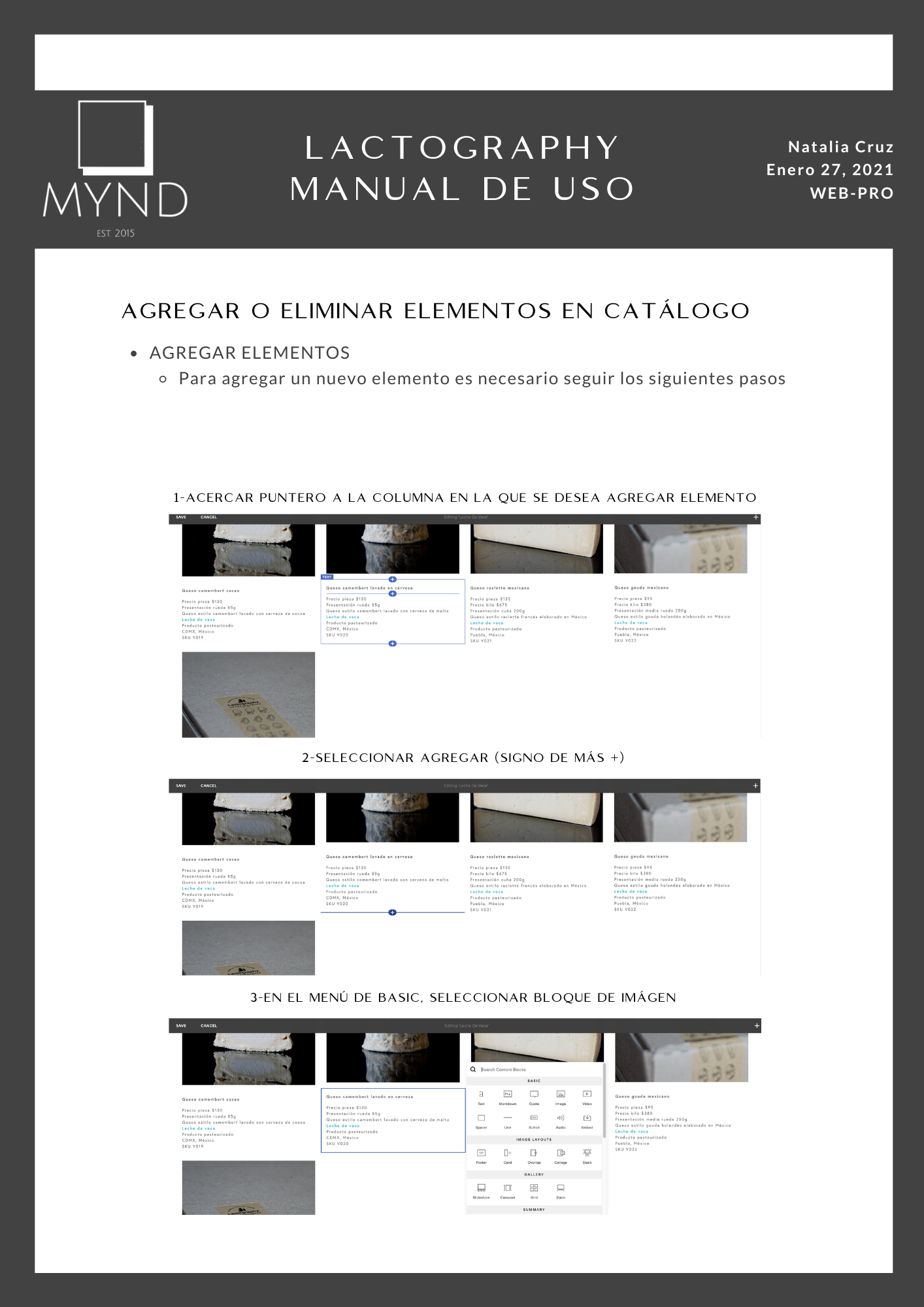
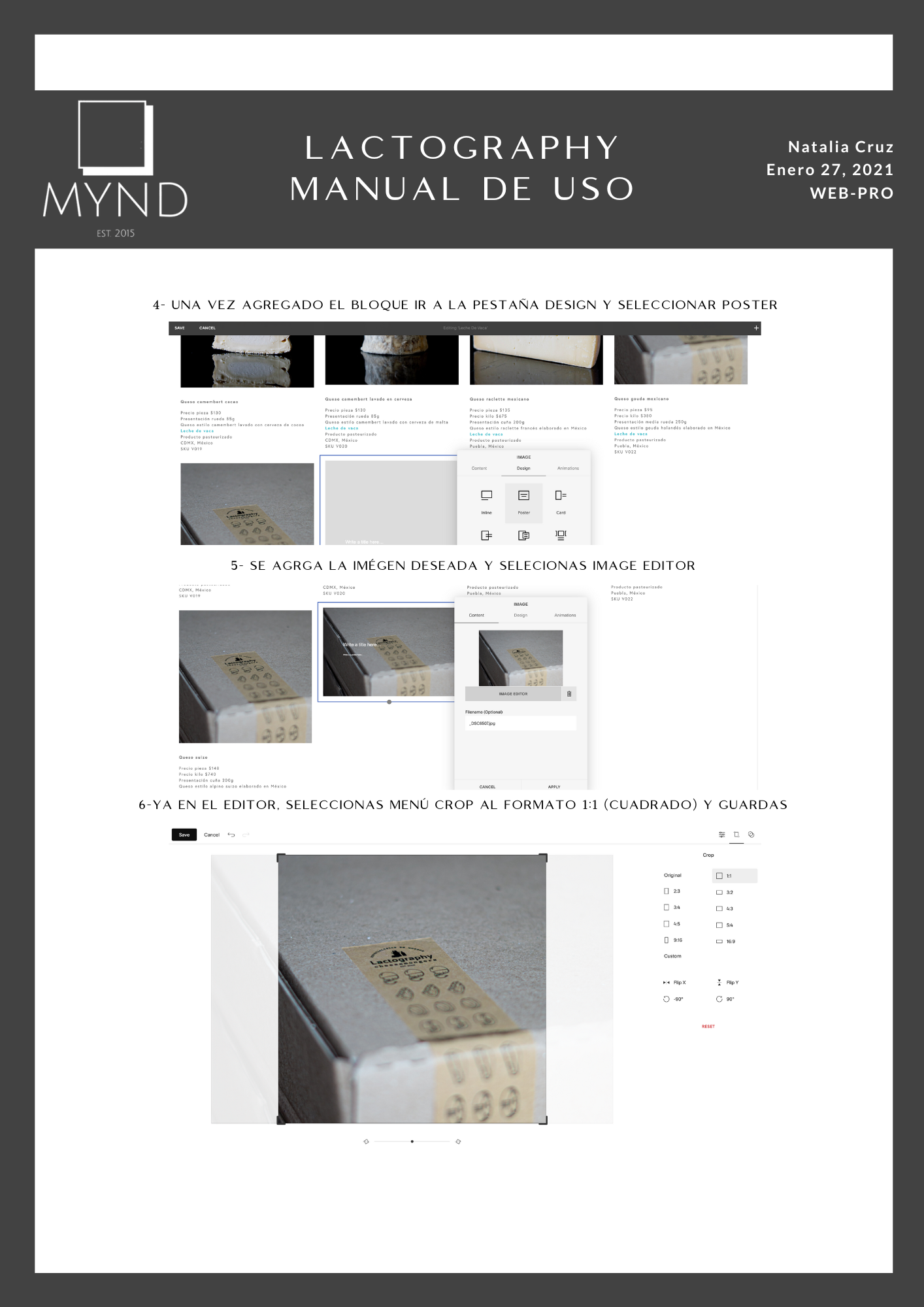
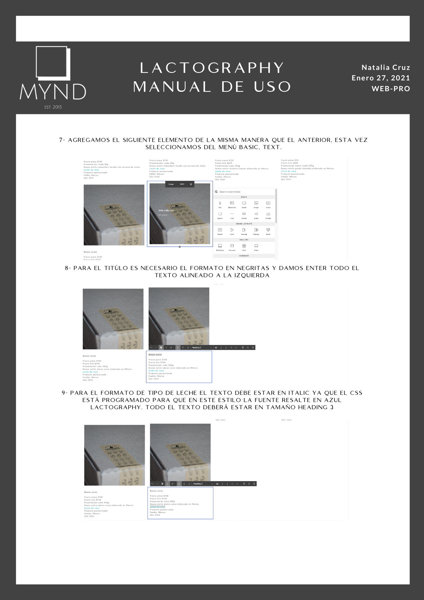
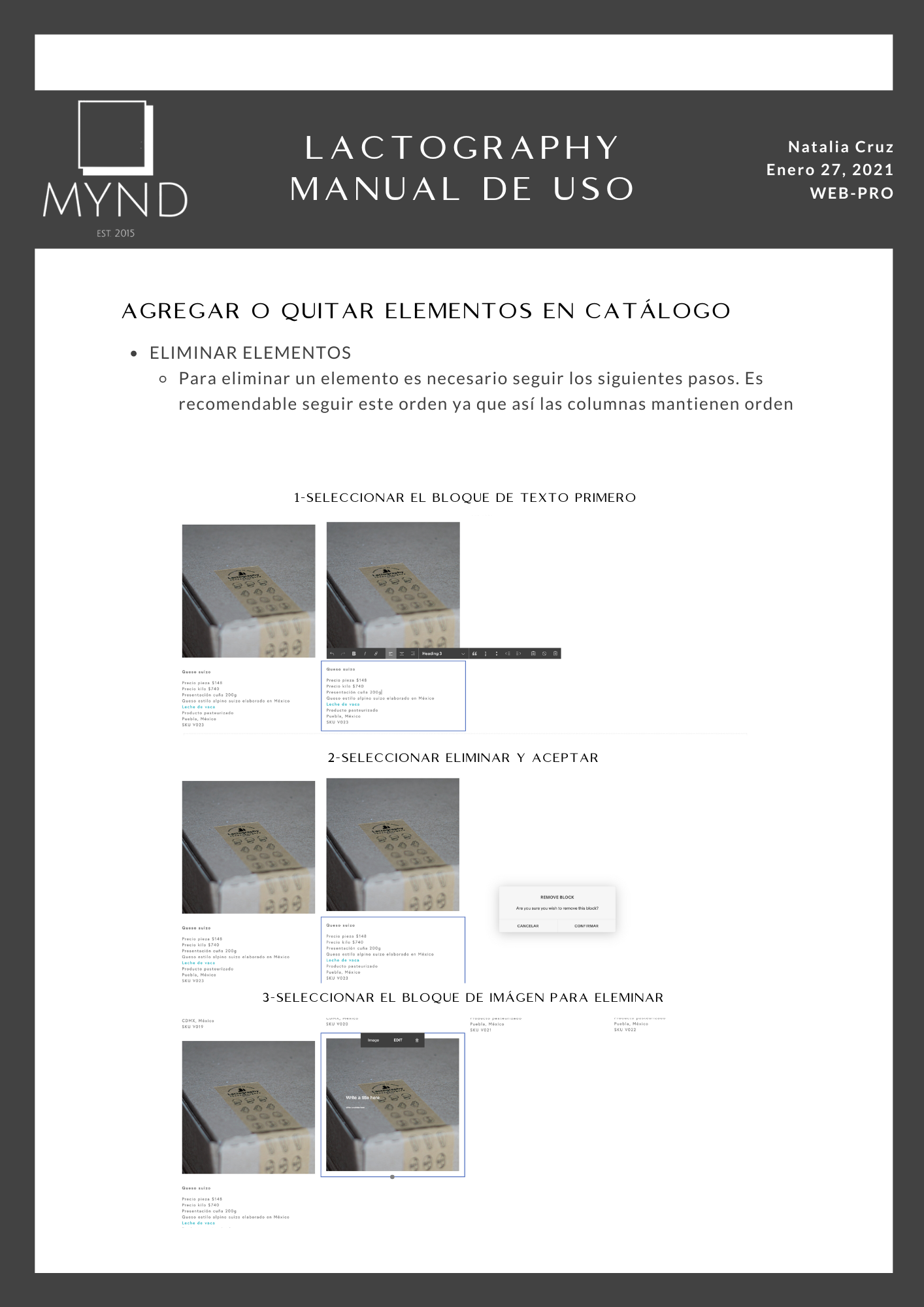
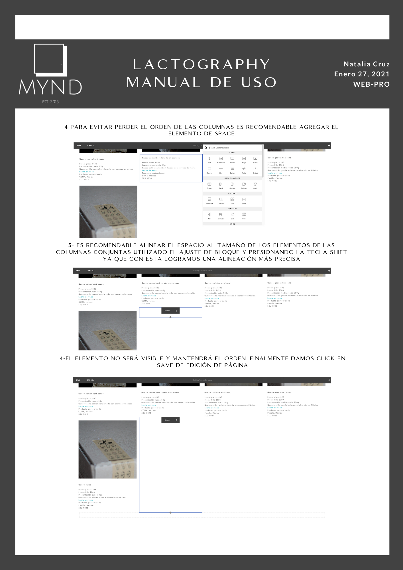
UI Customization Guidelines (User Manual for the Catalog):
A user-friendly system was developed to enable Lactography’s team to manage and update the catalog autonomously. A visual guide with step-by-step instructions allows users to easily add or remove products from the catalog:
Adding New Elements: Users are guided through selecting the appropriate columns, adding image and text blocks, using the design tab to format visuals, and ensuring product consistency by cropping images to a 1:1 ratio and applying specific text formatting (e.g., bold for titles, italic blue for milk type).
Removing Elements: The process is similarly intuitive, with a focus on preserving the layout’s order through a structured approach that involves removing text before images and using spacer elements to maintain alignment.
Filter System for Enhanced Usability:
To aid users in quickly finding their desired products, a set of filters was implemented. These filters allow users to browse by cheese type, milk type, origin, and price. This functionality speeds up product discovery and enables users to tailor their experience based on their preferences. The filters were placed prominently and designed to be easy to interact with on both desktop and mobile.
Ongoing Maintenance & Optimization:
The catalog system was built with scalability in mind, enabling Lactography to easily expand its offerings over time. Regular testing ensures that the website continues to meet the expectations of its user base, while periodic updates are made to improve usability and performance based on user feedback.
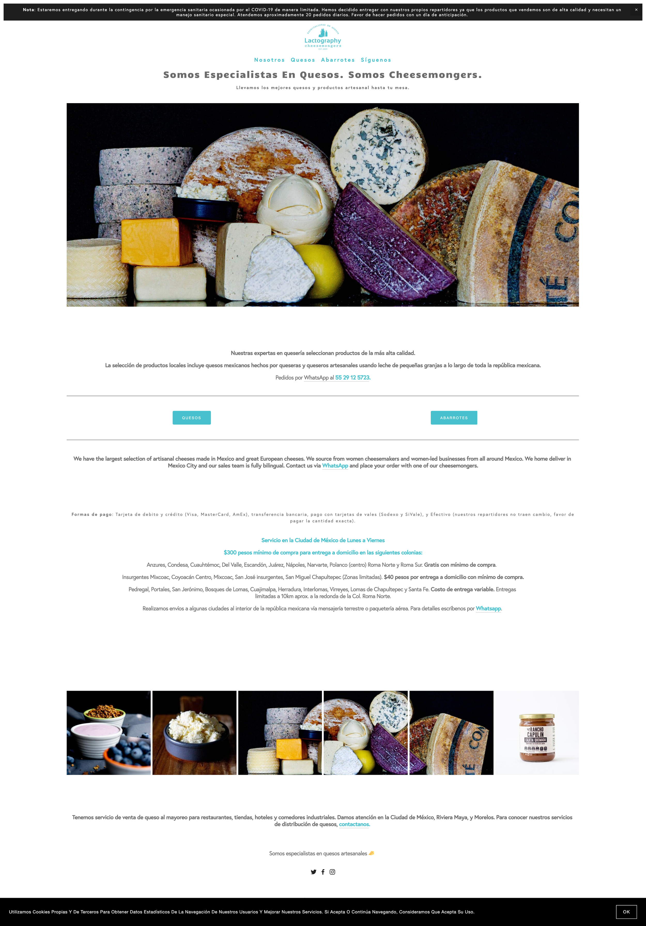
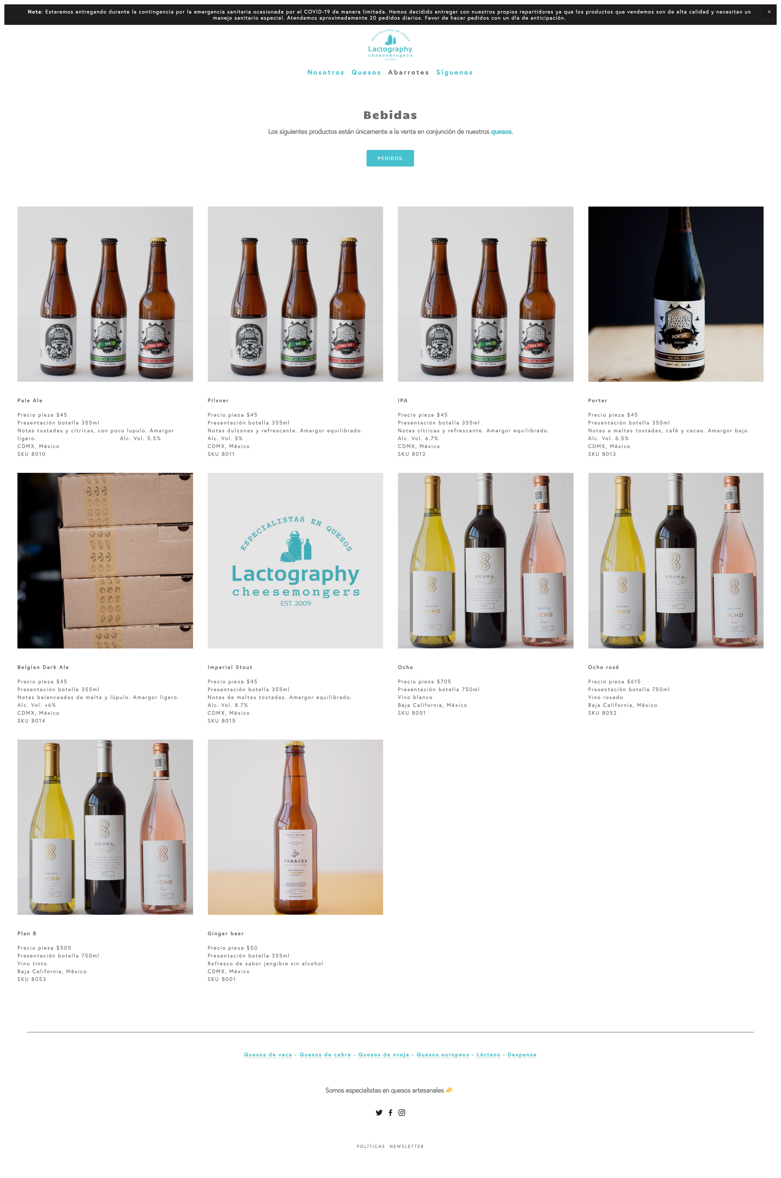
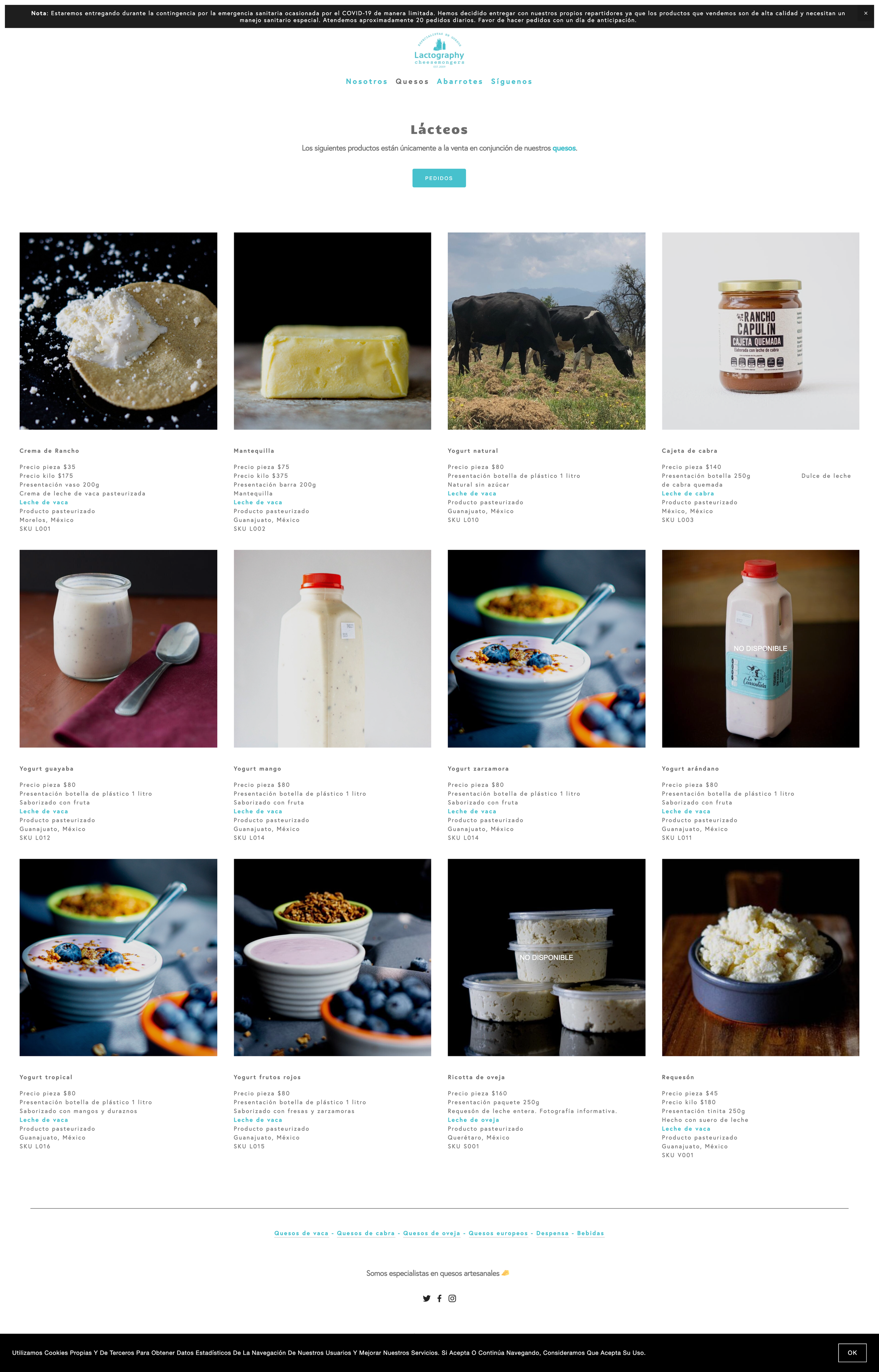
Website visualisation
-
![]()
Homepage
-
![]()
Cheeses
-
![]()
Drinks
-
![]()
Dairies
-
![]()
Sheep Cheeses
-
![]()
About Us
-
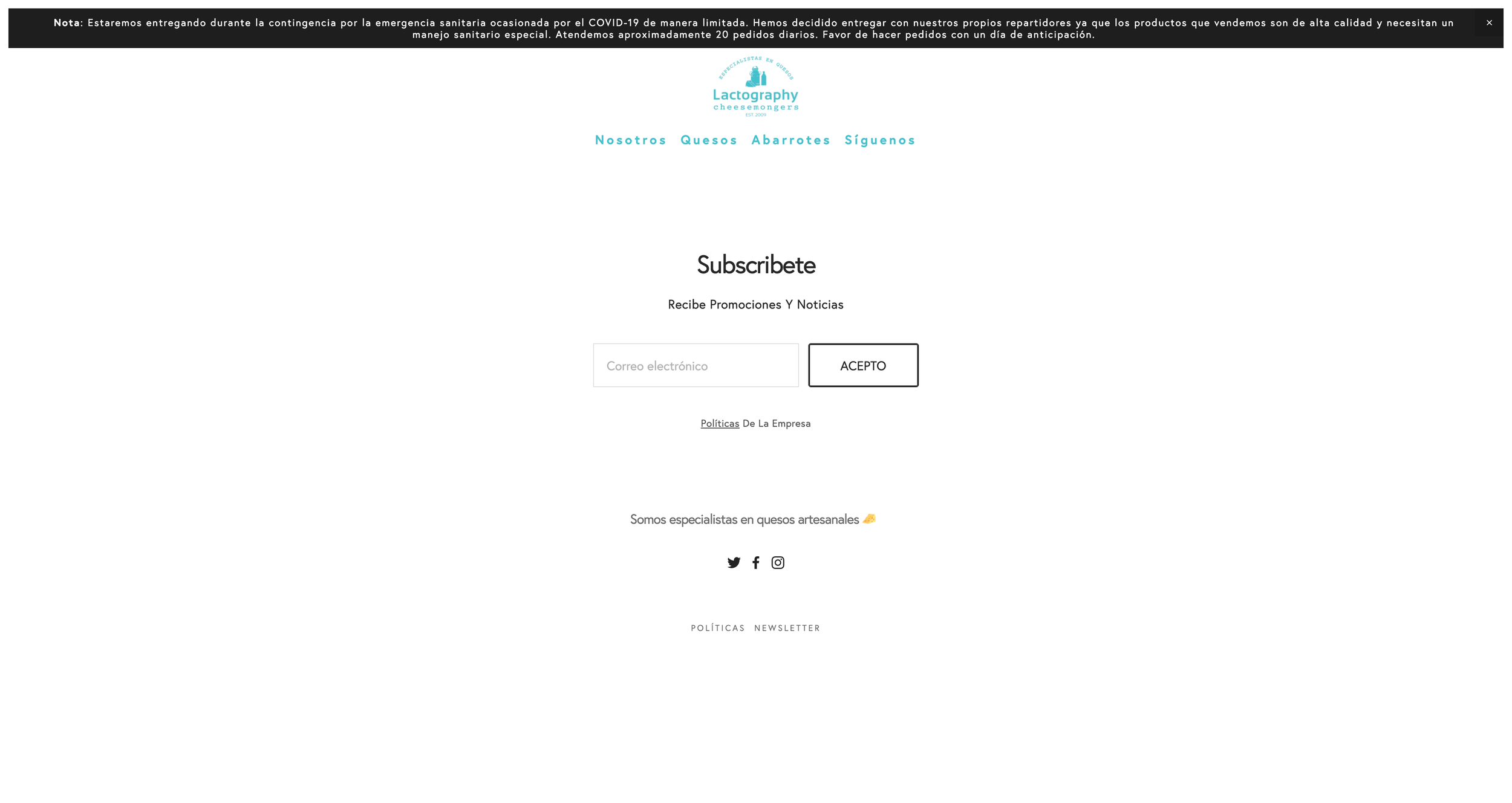
![]()
Newsletter Subscription
-
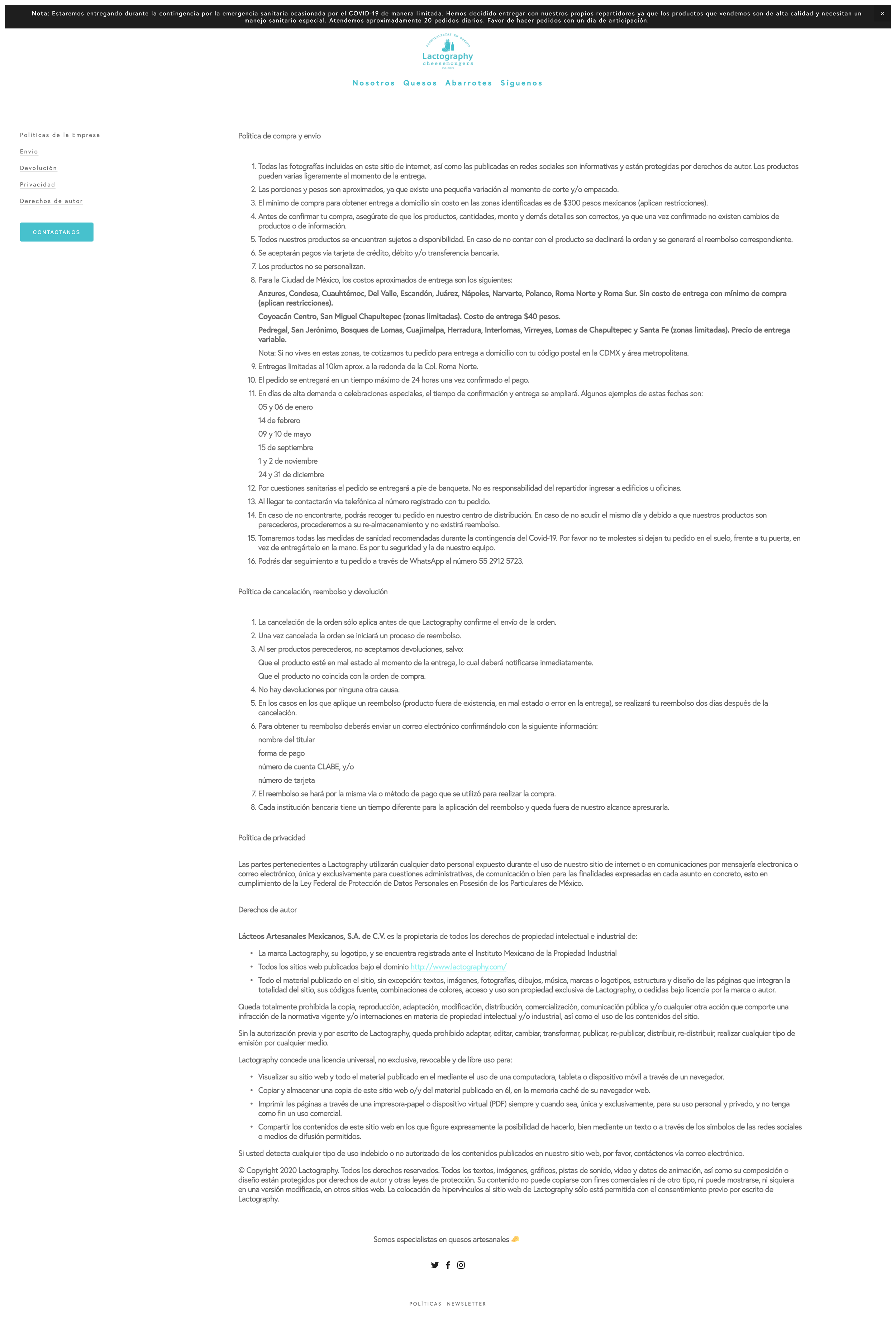
![]()
Terms and conditions
-
![]()
User Manual
-
![]()
User Manual
-
![]()
User Manual
-
![]()
User Manual
-
![]()
User Manual